# noticed marketing brand reference

This is the implementation reference for noticed marketing surfaces. The concise human brand kit is at [/brand](/brand) and the detailed image system and downloadable library are at [/brand/image-system](/brand/image-system).

For web page layout, surfaces, controls, and navigation, use the [Design System](/design-system).

## Identity and logo

noticed is an applied research team that builds products and AI models. Our first product helps builders get customers through people they already know.

- Use the complete wordmark whenever space allows.
- Use the n mark for compact squares, favicons, and app icons.
- Clear space: Keep clear space equal to the height of the wordmark's n stem.
- Minimum wordmark: 96px wide on screen
- Minimum mark: 24px square on screen
- Do not recolor, stretch, rotate, outline, or add effects.
- Do not detach the artwork from its supplied paper color.
- Do not typeset a replacement wordmark in another font.

## Assets

- [Light wordmark](/brand/assets/noticed-wordmark-light.svg) downloads as `noticed-wordmark-light.svg`. Use on the fixed light paper color only.
- [Dark wordmark](/brand/assets/noticed-wordmark-dark.svg) downloads as `noticed-wordmark-dark.svg`. Use on the fixed dark paper color only.
- [Light mark](/brand/assets/noticed-mark-light.svg) downloads as `noticed-mark-light.svg`. Use when the wordmark cannot remain legible at the available size.
- [Dark mark](/brand/assets/noticed-mark-dark.svg) downloads as `noticed-mark-dark.svg`. Use when the wordmark cannot remain legible at the available size.

## Typography

Fraunces is reserved for the noticed wordmark. All other text uses the existing Switzer type classes.

Use Switzer through `font-sans / --font-sans` for all marketing and interface copy.

[Download Switzer](https://www.fontshare.com/fonts/switzer)

| Size class | Font size | Line height | Weight | Tracking |
| --- | --- | --- | --- | --- |
| `type-sm` | 14px | 1.4 | 400 | 0.01em |
| `type-base` | 16px | 1.4 | 400 | 0.005em |
| `type-md` | 18px | 1.4 | 400 | 0 |
| `type-editorial` | 18px | 1.6 | 400 | 0 |
| `type-lg` | 22px | 1.3 | 400 | -0.005em |
| `type-xl` | 32px | 1.2 | 400 | -0.02em |
| `type-hero` | clamp(42px, 7vw, 72px) | 1 | 600 | -0.03em |

### Hero headline

- Class: `type-hero`
- Use: The single landing-page headline. Keep it short and outcome-led.

### Section headline

- Class: `type-xl`
- Use: A scannable headline that opens a standard marketing section.

### Section statement

- Class: `type-xl`
- Use: The main thought in a marketing section and the landing narrative.

### Feature heading

- Class: `type-md`
- Use: Titles for cards, steps, benefits, and other compact feature groups.

### Supporting body

- Class: `type-md`
- Use: Explanations and prose that support a statement without competing with it.

### Regular body

- Class: `type-base`
- Use: Longer paragraphs and general marketing body copy.

### Editorial body

- Class: `type-editorial`
- Use: Long-form blog and article prose. Keep the 18px size and 1.6 reading rhythm; do not use for compact marketing copy.

### Navigation and link

- Class: `type-sm`
- Use: Marketing navigation, footer links, and compact calls to action.

### Eyebrow and label

- Class: `type-sm`
- Use: Short labels, small chips, and restrained section eyebrows.

### Responsive pairings

Size classes are fixed recipes. Switch classes at breakpoints only through these approved component pairings.

- Feature copy: `type-base md:type-md`
  - Mobile/default: `16px` (`type-base`)
  - Desktop from `md / 768px`: `18px` (`type-md`)
  - Use for feature headings and supporting copy that step from compact mobile cards to wider layouts.
- Marketing action: `type-sm md:type-base`
  - Mobile/default: `14px` (`type-sm`)
  - Desktop from `md / 768px`: `16px` (`type-base`)
  - Use for calls to action inside responsive marketing cards.

### Fluid exception

- Hero: `type-hero`
- Value: `clamp(42px, 7vw, 72px)`
- Range: 42px minimum to 72px maximum; 7vw scales between them.
- The hero is the only fluid type size.

## Brand colors

Use semantic roles in UI. The spring accent marks an action or state, never decoration.

- Spring 50: `--brand-50` = `oklch(0.98 0.04 125)`. Hover wash
- Spring 100: `--brand-100` = `oklch(0.95 0.09 125)`. Soft fill
- Spring 200: `--brand-200` = `oklch(0.92 0.13 125)`. Base accent
- Spring 700: `--brand-700` = `oklch(0.45 0.09 145)`. Accent text on light
- Spring 900: `--brand-900` = `oklch(0.25 0.06 150)`. Text on accent
- Spring wash: `--brand-wash` = `oklch(0.92 0.13 125 / 0.22)`. Selection and callout wash

## Media

noticed handles digital relationship work so people can focus on real relationships.

A bright, placeless analog world seen like a fading human memory. Technology stays out of frame so the result of the product feels tangible: more attention, presence, and time with other people.

Most AI brands show the machinery. noticed shows what the machinery gives back: attention, presence, and time with other people. The imperfect analog treatment makes that promise feel human instead of technical.

### Fixed image layers

### Atmosphere

- Abstraction: 85%
- Use: Text backgrounds, quiet UI surfaces, transitions, and simple editorial assets.
- Rule: Nothing is identifiable. Derive it from an approved Brand Scene so the palette and world stay consistent.
- Example: [open image](/brand/images/atmosphere/masters/08-converging-paths--medium.png)

### Brand Scenes

- Abstraction: 70%
- Use: Website, social, and editorial imagery when human connection is the subject.
- Rule: Show the presence of 3–7 adults. Faces, clothes, hands, objects, landmarks, and literal scenery stay unreadable.
- Example: [open image](/brand/images/brand-scenes/masters/03-crossing-paths--medium.png)

### Real Life

- Abstraction: 40%
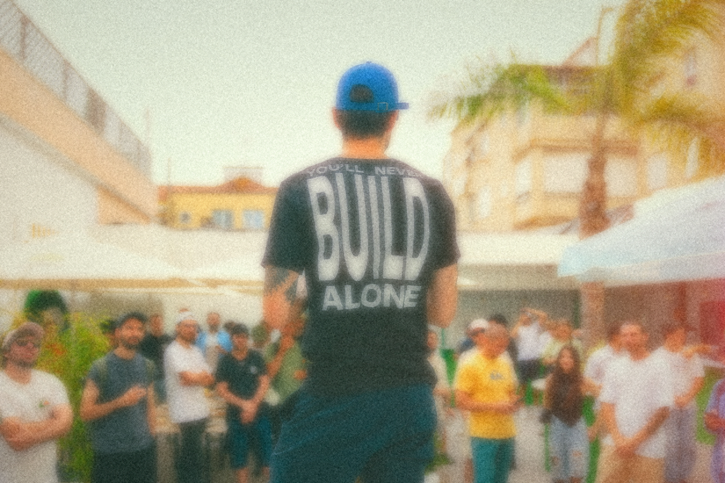
- Use: Founder, team, and event photography when the moment matters more than detail.
- Rule: Keep the source truthful and apply the fixed code treatment. Never regenerate a real photograph.
- Example: [open image](/brand/images/real-life/examples/real-life-40.jpg)

### Real Life Detail

- Abstraction: sharp exception
- Use: Portraits, speakers, product demonstrations, and documentary images where identity or information must stay clear.
- Rule: Keep detail sharp. Add bright spatial color-light, fine grain, gentle halation, and a light leak.
- Example: [open image](/brand/images/real-life/examples/real-life-detail.jpg)

### Image palette

- Sky: `#9BC9D3`. Bright air and open space
- Leaf: `#7EAA67`. Organic movement
- Cream: `#EEE4C9`. Warm light and breathing room
- Deep teal: `#185057`. Depth without a dark cast
- Coral: `#F1784C`. Spatial light leak or afterimage

### Social cards

- Atmosphere · light-canonical: Use a distinct approved Atmosphere asset for each post when practical. Keep the image full-frame and add the fixed paper veil for copy contrast. Do not create a dark-mode Atmosphere card.
- Analog solid · light: Use the image system's deterministic spatial palette and fine grain over paper.
- Analog solid · dark: Use the image system's deterministic spatial palette and fine grain over dark paper.

- Default: analog-light with metadata on.
- Metadata: four corners — `noticed` top left, `{label}` top right, `{author}` bottom left, and `{date}` bottom right; no separators or URL.
- Title: balanced full-width Switzer, editorial-lowercase, 124px maximum with metadata and 142px without.

### Subjects

Use:

- Warm introductions among three or more adults
- People arriving, converging, or crossing paths
- Small groups walking and talking
- The edge of a lively gathering
- Shared attention without a visible device

Avoid:

- A single hero, couple, or intimate pair
- Weddings, family holidays, meals, or children
- Clear faces or a row of people shown only from behind
- Recognizable cities, landmarks, or generic nature photography
- Cars, screens, robots, or prominent technology
- Night, ruins, excessive greenery, brown, or sepia

### Ready-to-use Brand Scene masters

- [01-walking-and-talking--medium](/brand/images/brand-scenes/masters/01-walking-and-talking--medium.png)
- [02-close-conversation--close](/brand/images/brand-scenes/masters/02-close-conversation--close.png)
- [03-crossing-paths--medium](/brand/images/brand-scenes/masters/03-crossing-paths--medium.png)
- [04-shared-afterimage--wide](/brand/images/brand-scenes/masters/04-shared-afterimage--wide.png)
- [05-warm-introduction--close](/brand/images/brand-scenes/masters/05-warm-introduction--close.png)
- [06-inside-the-gathering--close](/brand/images/brand-scenes/masters/06-inside-the-gathering--close.png)
- [07-walking-rhythm--medium](/brand/images/brand-scenes/masters/07-walking-rhythm--medium.png)
- [08-converging-paths--medium](/brand/images/brand-scenes/masters/08-converging-paths--medium.png)
- [09-after-the-gathering--wide](/brand/images/brand-scenes/masters/09-after-the-gathering--wide.png)
- [10-social-afterimage--wide](/brand/images/brand-scenes/masters/10-social-afterimage--wide.png)
- [11-three-way-exchange--close](/brand/images/brand-scenes/masters/11-three-way-exchange--close.png)
- [12-arrival-rhythm--wide](/brand/images/brand-scenes/masters/12-arrival-rhythm--wide.png)

- Ratios: master 3:2, 16:9, 1:1, 4:5, 9:16.
- Generation: Use the Content Lead noticed-image-studio skill for new Brand Scenes, Atmosphere derivation, standard crops, and real-photo treatments.
- Hero: Use one bare image or video from the noticed image system. Give copy its own calm field instead of adding a heavy dark scrim.
- Product: Product UI uses no imagery beyond avatars and functional icons.

## Video

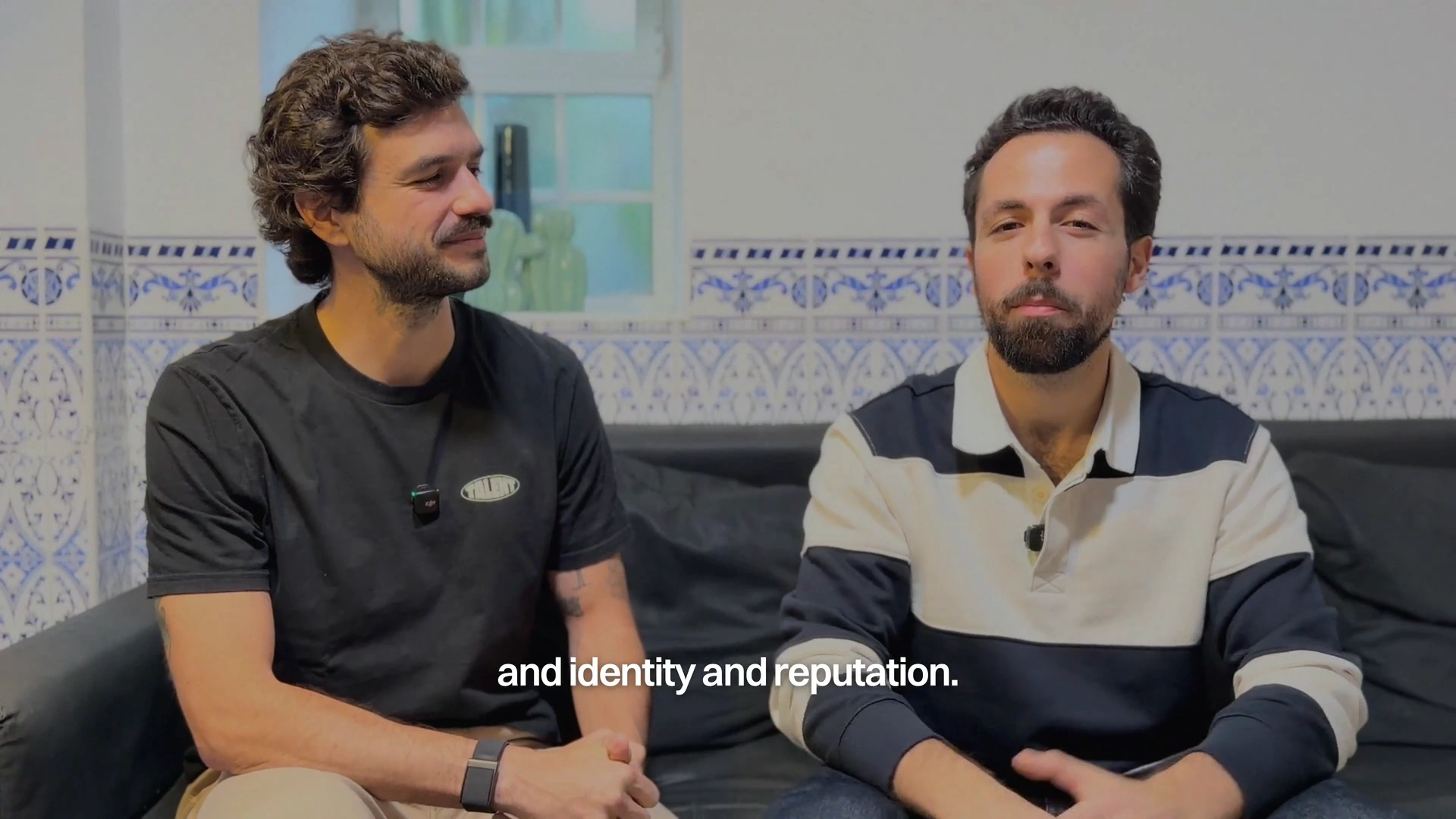
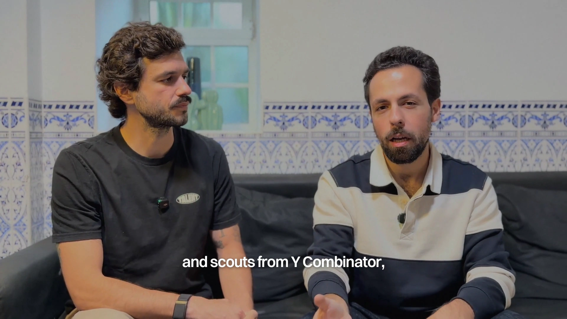
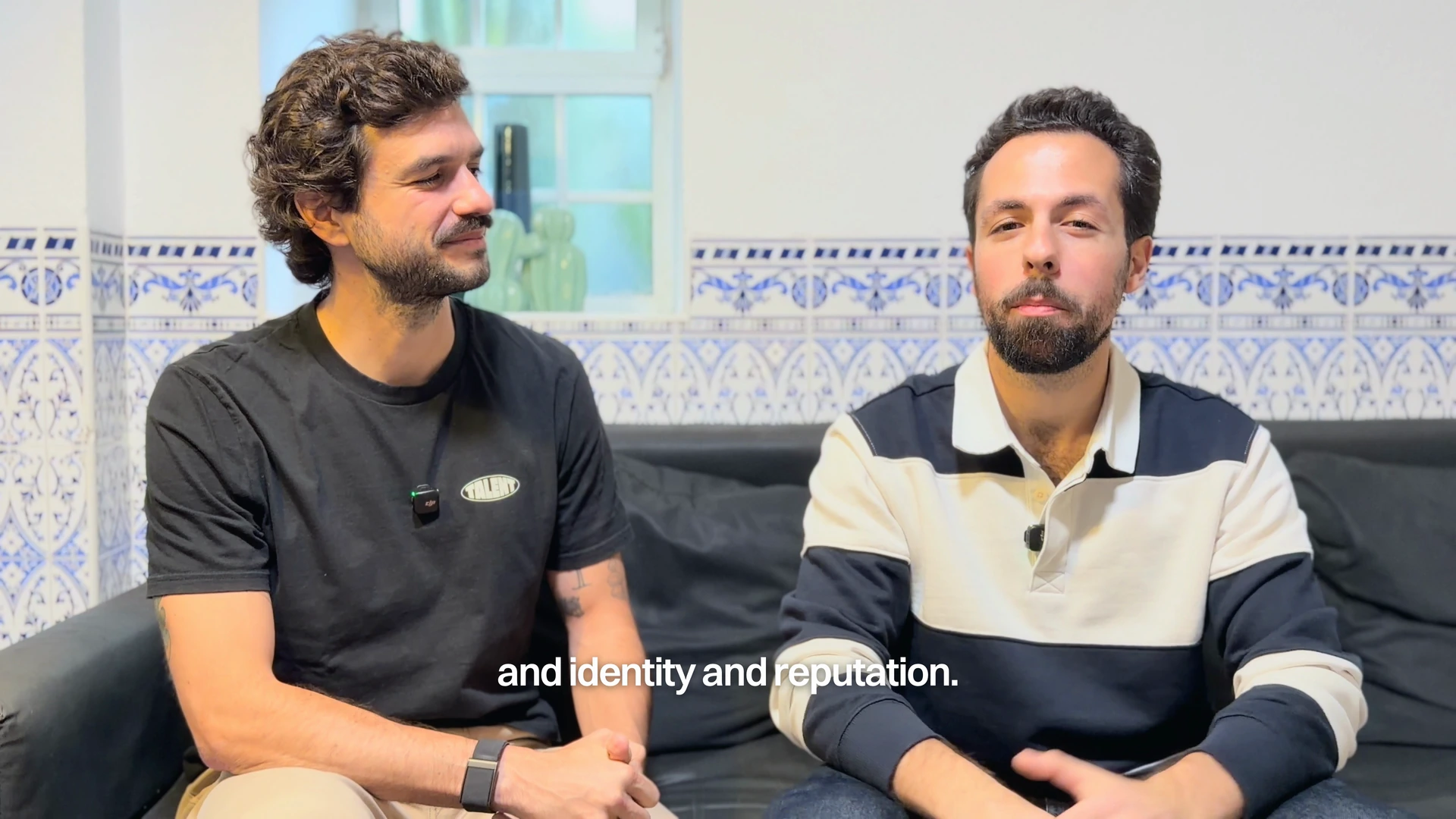
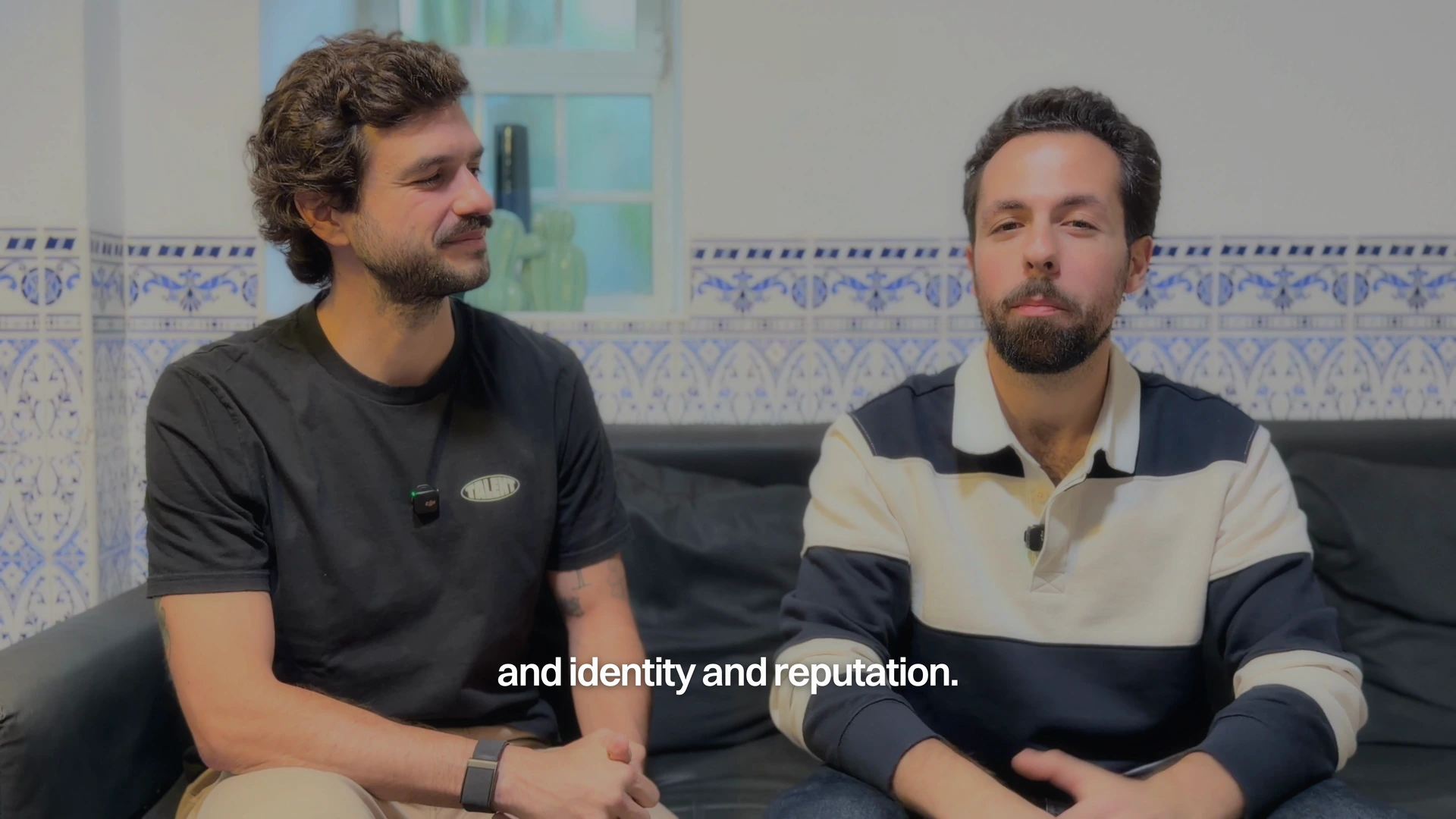
Deep shadows, natural color, subtle grain.

Deepest with grain is the selected reference for this video. The wider video direction is draft / work in progress, based on one source. With each new video, explore grading and subtitle options, adapt to each source, and refine noticed’s style before treating it as a standard.

- **Color:** Retain shadow depth and natural contrast without a whole-image wash or milky blacks. Keep skin natural and retain source color without an extra saturation boost.
- **Texture:** Add subtle monochrome grain and gentle highlight softness while keeping faces clear. This reference uses no flare, light leak, or sky/teal overlay.
- **Subtitles:** Switzer Semibold in white, tight spacing, no outline, and a subtle blurred shadow. Use short phrases and preserve names and punctuation. For future videos, place captions lower than this reference, starting around 90% of frame height in 16:9, within the platform safe area.

Normalize the camera profile and HDR/log footage for SDR delivery, correcting each source individually. This bright source needed extra darkening; that correction is specific to the footage. Match the finished tone, color, and texture to the references, then check faces, bright surfaces, and shadows at the intended viewing size.

### Approved video and stills

- [Approved reference video](/brand/video/noticed-video-deepest-grain.mp4)
- [English captions](/brand/video/noticed-video-reference.vtt)
- [Reference still 00:03](/brand/video/deepest-grain-03.webp)
- [Reference still 00:12](/brand/video/deepest-grain-12.webp)
- [Reference still 00:44](/brand/video/deepest-grain-44.webp)

### Look boundaries

- [Selected / Deepest + grain](/brand/video/deepest-grain-12.webp): Deep shadows, natural color, subtle grain, and clear faces.
- [Too bright](/brand/video/too-bright-12.webp): White walls and shirts dominate the image.
- [Too dreamy](/brand/video/too-dreamy-12.webp): Extra diffusion makes faces and fine detail hazy.

### Subtitle defaults

- Font: Switzer, weight 600, #FFFFFF; no outline.
- At 1920×1080: 52px, tracking -0.03em, baseline around 90% of frame height in 16:9 (starting point for future videos).
- Shadow: 5px blur, 2px down, 59% opacity.
- Scale size and shadow proportionally with resolution. Center captions within the platform safe area; adapt placement for other aspect ratios.

## Voice and casing

Use sentence case for marketing copy and titles. noticed is always lowercase. Preserve proper noun and acronym casing, including GitHub, LinkedIn, and AI.

### Use plain English

Choose familiar words. Remove jargon and anything written to sound impressive.

- Good: “Your agent remembers who can help.”
- Avoid: “Leverage an intelligent relationship graph.”

### Be brief, but human

Say only what helps, then read it aloud. Warmth wins over clipped brevity.

- Good: “You focus on building. noticed keeps up with the people around it.”
- Avoid: “Build. Connect. Win.”

### Lead with the outcome

Start with what changes for the reader, not the mechanism behind it.

- Good: “Find the right person while the moment still matters.”
- Avoid: “Our graph runs semantic retrieval across your data.”

### Speak to you

Address one person as you. Never call them a user, customer, or member.

- Good: “Your network is already full of people who can help.”
- Avoid: “Users can discover relevant contacts.”

### Keep the brand basics

Write noticed in lowercase. Use no emojis or em dashes. Avoid hype and do not explain AI unless asked.

- Good: “Our first product helps builders get customers through people they already know.”
- Avoid: “noticed is an AI-powered game-changer.”

## Motion and reduced motion

- Default: `200ms` with `ease-out`.
- Editorial reveal: `marketing-reveal-motion`, 550ms, cubic-bezier(0.45, 0.05, 0.55, 0.95), 16px offset, 18% viewport inset, once.
- Interaction motion uses 150–200ms ease-out. Editorial reveals use the named slower token. No bounce, spring, or decorative movement.
- Scroll-reveal content enters once at an 18% viewport inset. The section surface stays opaque and content remains present and legible without animation.
- Honor prefers-reduced-motion. Remove transforms and collapse non-essential animation and transition duration.

## Accessibility

- Use semantic headings in order and preserve landmark navigation.
- Keep normal text at content-tertiary contrast or stronger.
- Keep keyboard focus visible with the ring token and a minimum 3:1 focus indicator.
- Give informative media useful alt text and mark decorative media with empty alt text.
- Do not encode meaning by color, motion, or hover state alone.

## Sources

- [Canonical specification](https://github.com/noticedso/noticed/blob/main/apps/noticed-agent/app/lib/brand/marketing-brand-spec.ts)
- [Shared CSS tokens](https://github.com/noticedso/noticed/blob/main/packages/tailwind-config/shared-styles.css)